Showing posts with label James Roberts. Show all posts

Thursday, August 29, 2013

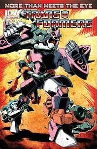
Comic Review: Transformers More Than Meets the Eye #20

                Does More Than Meets the Eye retain its title as best comic you’re not yet reading?  Let’s see.


Cover:
                Yes, there are multiple covers (it’s and IDW book so of course there are), and yes I grabbed the one on the top (the Alex Milne cover).  This one depicts Rodimus carrying Tailgate (who has been dying for the last few issues) as they are being chased by the Legislators (personality-less robots that were bred to kill by Tyrest – the main villain in this book as of the last couple issues). 

                I like the art on the cover as it is telling a story while featuring two of the prominent characters from the book.  It also forces us to ask questions if we are a new reader such as “what is chasing Rodimus?” “Why is Rodimus carrying Tailgate?” or just a general “Who are these characters?”  The composition leads us to Rodimus’ face as the main focus of the cover, however the coloring actually forces our eye to the giant bright yellow triangle over his right shoulder.  While I understand that that actually makes sense based upon the overall lighting scheme of the cover in general, it doesn’t help the composition when the coloring is in direct contrast.  That being said, shrouding a good portion of Rodimus’ face in shadow doesn’t help force the eye there either.  This is the unfortunate cross to bear with more “realistic” computer coloring.  If this comic was produced twenty-five years ago, the reds would be red, the white’s would be white and the yellows would be yellow, and distinctions would be able to be made because of it.  Now the Transformers comics are some of the best on the market in terms of combining the lineart with the color to create a cohesive image, but it just doesn’t work well on this cover (which is unfortunate as the cover is where you want it to work the most).  There is also a slight tangent if you look at the tip of Tailgate’s right foot and Rodimus’ knee.  This is exacerbated by the fact that they are pretty much the same color as well, so even with the heavier outline it is difficult to determine where one stops and the other begins.

                The only other gripe that I have is with the signature.  It’s huge!  Believe me, I’m all for signing your artwork and taking ownership of it in terms of receiving the due credit, but holy crap.  This is along the same lines as the 1990s Todd McFarlane or Greg Capullo signatures that were, at times, oppressive to the artwork itself.  While Milne at least kept his signature confined to the lower right corner (and he avoided putting a box or some other device around it to draw even more attention to it) the signature itself is just too involved in the artwork, and something that should be present but not oppressive is quite the opposite.  

6/10 – While the overall design is good, the execution hurts the image. 

Story:
                The story by James Roberts is nearing its conclusion, something that has been building up since issue number one.  Reading a lot of the Transformers comics every month, it took me a little time to remember what happened in the last issue.  The “story so far” box on the inside front cover helps a bit, but seeing the ramifications of the events unfold as jump cuts on the first page caused me to pause and search my memory banks for some semblance of what happened last issue.  While I am glad that there is a page in the back specifically dedicated to showing each of the Transformers involved in that story (especially since this book doesn’t use a whole lot of the traditional Transformers that we all know and love) not having that info available at the outset causes me to try and remember who everyone is, and sometimes the color-scheme and designs are so similar that it becomes confusing. 

                The story itself is great.  It doesn’t really tie up any loose ends as much as it forces them to their next logical stage before the conclusion.  Roberts does an excellent job of juggling at least four different aspects to the story, each part focusing on different characters and then bringing nearly all of them together by the end, ensuring that the final part is laser focused.  When you have a stable of characters, both heroes and villains, in which to pull from, it may seem difficult to develop some of the lesser known characters and give them the same weight that a franchise staple would have.  Take for example Tyrest, the villain.  When you have villains such as Megatron, Shockwave, or Bludgeon at your disposal, building up Tyrest to that kind of level might seem like an insurmountable task, but Roberts does it, and it only takes a few short issues to do it.  His actions, and more importantly the motivations for those actions, are as heinous as anything you would expect to see from any of the aforementioned villains.  Roberts writes him as almost a delusional cult leader, with his actions being justified (in his own mind anyway) by the fact that they will bring him closer to eternal light.  The fact that there may be actual credence to his claims by the end of the issue is a shock in its own right. 

                Not only do we get all of that story development, but Roberts also takes the time to weave in character development for Skids, everyone’s favorite memory wiped Autobot.  We as readers finally get to learn how Skids got in the condition he’s in (think Men in Black memory wiping device, but with the ability to implant a thought or suggestion in the brain of the target).  It’s actually a bit more complicated than that, but it brings us back to Tyrest and shows that he has been in the thick of things from the beginning.  The fact that Roberts said that this “Remain in Light” storyline was the big payoff to all of the previous issues, and then to actually exhibit the skill  to pull off that bold claim is incredibly impressive.  Roberts is by far one of the best writers in the business today, and hopefully IDW can keep him attached to this book for a long time to come.

9/10 – The story itself is top notch, the little parts in the beginning where things just progress naturally from the last issue takes a couple panels to get used to.  The cliffhanger ending is one of the best I have seen in recent memory, and actually gets me excited to read a comic book again (who knew that was possible).

Art:
                Alex Milne, with Brian Shearer’s assistance on the inks and Josh Burcham and John-Paul Bove on colors, provide another artistic tour de force.  I’m not going to lie, sometimes the artwork can be a bit confusing with all of the different moving parts going on, but the fact that Milne and Co. pack so much into each page, hell, each panel and it doesn’t become an unintelligible mess speaks to their own individual abilities.  Milne is a master of expression with these characters as well, making them feel more like human beings in disguise as opposed to giant hunks of metal.  The thing that makes me hesitant to really embrace Andrew Wildman’s classic Transformers work (the stiff blocky nature and overall feel that everything looks like the old toys) is the exact opposite here.  There is so much movement in the characters as well as the overall design of the panels that everything feels organic and animated. 

                Milne also does a good job of mixing up camera angles in this one.  He still tends to rely too much on midrange shots, with very few, if any, long establishing shots thrown into the mix, which is either a blessing or a curse with his amount of detailed work.  Even without the long shots, he does a decent job of changing the angle of the camera up enough to ensure that the exact same shot is not repeated over multiple panels (unless it’s for dramatic effect). 

9/10 – Milne is the quintessential Transformers artist in my opinion and regardless of the title he works on I will be a longtime fan of his work.

Overall:  9/10 – The cover aside, this book was a masterpiece of storytelling.  Showing how to successfully move a story along (and actually move it along, not just give the impression that it is) while setting up the next issue to blow the minds of the readers.  I don’t know why I have to repeat myself by now, but if you aren’t reading this series, pick it up now.

Thursday, August 1, 2013

Comic Review: Transformers More Than Meets The Eye #19

                In light of certain recent financial restrictions, I am only reviewing comics that I would normally purchase during a given week for the foreseeable future.  We dip back into the Transformers well again this week, reviewing the newest issue of probably my favorite book being produced right now.


Cover:
                It took two comic stores for me to even find this issue (Syracuse comic shops, what are you gonna do?) and when I did, I grabbed the last copy available.  I didn’t have my choice of covers, but I think I got the better end of the deal anyway as the Sean Chen cover is very well done.  The cover is actually more than just a pinup of two characters (in this case Whirl and Cyclonus) and actually depicts a part of the story from the comic itself (as many of the Transformers comics tend to do).  All of the angles present here, between swords and Whirl himself do more to help the eye move around the page than they do to hinder it (which is the exact opposite of what you would assume).  Those angles serve to frame the figures and take what could have been a very static, boring cover and jazz it up a bit.  Don’t get me wrong, it still feels a little generic, but the flourishes that Chen provides, including the details on the swords themselves, serve to distract, at least momentarily from the relatively standard cover.

                Something should be said for the linework and detail put into the characters.  While it’s a bit of a departure from what we are used to seeing in the interiors (which are usually left more open for color) this works incredibly well, and I would buy the shit out of a Sean Chen illustrated Transformers book.

8/10 – Incredible art jazzes up a generic cover.  In the hands of a less experienced or talented artist this would have been a flop of epic proportions.  Chen makes it work with an almost Travis Charest level of attention to detail.

Story:
                The art on Transformers comics rarely disappoints, but I’ll tell you something: the writing on this batch of titles is some of the best I have ever read (and I’ve been reading comics for a looooong time).  This issue is right up there with the old Claremount-era X-Men books in terms of fitting so much together into one issue.  James Roberts has been building this universe and everything feels like it is starting to pay off as old mysteries are starting to be solved (what’s up with the lack of memory for Skids) while new and interesting narratives are being started (the fact that Ultra Magnus is an ideal, not a person anymore (that was incredible), the Ratchet/Pharma dick measuring contest that takes an unexpected and unfortunate turn, Whirl and Cyclonus finding and freeing the Circle of Light, and the artist formerly known as Ultra Magnus confronting Tyrest take place in this regular sized issue. All of this is on top of the fact that we are still watching the clock tick down on Tailgate in terms of his life expectancy, and it just keeps you on the edge of your seat for the entire book.

                Roberts does an incredible job of juggling every single storyline without letting any feel jilted in any way.  He takes what could have been mass confusion and chaos and uses that to craft a mood where we feel like we are with the captive Autobots.  He expertly handles every big reveal (and there are a lot of them) while moving the story along naturally and with all of the humor and flair that you are used to when he puts pen to paper. 

10/10 – Roberts continues to live up to the lofty expectations he has put into place throughout the series.  Between plot, pacing and dialogue he is firing on all cylinders.

Art:
                Alex Milne (with inks by Brian Shearer) do an incredible job of keeping the artwork at a consistently high level throughout the book.  The settings are all the same, but there are so many characters and so many moments that you could easily see the art team focusing on their favorites and letting the quality slip in other parts of the book.  Milne is as consistent as they come, providing crisp, clean artwork that works so well with the coloring (done by Josh Burcham) that you would think he does it all himself. 

                Actually, I need to take a minute to single out Burcham because of the work he does on this title.  Milne’s pencils cannot be the easiest things to color and still maintain some semblance of separation based on the lack of solid black in his artwork.  It pretty much all falls to Burcham (there’s not much Shearer can do in terms of spotting lacks without taking away from the style of the artwork in general) to provide us with the feeling of space, grounding each scene in “reality” while also providing separation between objects in the foreground and background (both with so many components that most normal colorists would either go crazy or say to hell with it and just start throwing solid colors around).  Burcham’s design sense as well as his ability to interpret the artwork is something that cannot be understated here.  For a visual sample of that, look no further than the sequence where Whirl and Cyclonus are infiltrating a weapons cache.  There is an alarm sounding and a red light flashing, bathing the entire scene in a red glow.  Without the ability to use various colors as separation mechanisms, the characters tend to get lost in the background elements.  Burcham is kind of hamstrung by the color palette, I understand that, but it does a good job of highlighting what Milne’s artwork could be like in less capable hands.

9/10 – Never underestimate a good artist-colorist combination.  These guys are at the top of their game and the art itself marries perfectly with the script from Roberts to create a cohesive masterpiece.

Overall: 9/10 – There’s a reason this hasn’t relinquished the crown of “favorite comic” in my current library.  All of the creators involved are performing at a high level, and the fact that Hasbro and IDW are letting the characters be (seemingly) killed off and altered significantly shows that they believe in the creators, which goes a long way when it comes to licensed comics. 

Thursday, April 4, 2013

Comic Review - Transformers Spotlight: Trailcutter


            It’s another installment of the Transformers Spotlight series.  This time with 100% more Trailcutter!


Cover:
            Cover “A” by Matt Frank (the interior artist) does a great job of giving us an idea of what is actually going on in the issue itself.  The other covers are stock illustrations of Trailcutter, so I am lucky that I grabbed the “good” cover to evaluate.  It’s Trailcutter versus the Insecticons!  While Trailcutter in the comic itself is a little more confident than what he shows on the cover, it is a decent representation of what we are going to see.  The design is fairly effective, giving us a feeling that Trailcutter is being swarmed and overwhelmed just by making the shapes on the top darker and therefore more foreboding.  Not only that, but everything points right to Trailcutter on the cover, making sure that he remains our focus.

            I really enjoy the coloring on this by Josh Perez and the way that he (and Frank) balance the heavy shadows on the top with virtually no shadows on the body of Trailcutter himself.  The force field effect is impressive as well as it leaves an orange highlight on everything that is most intense on his hands, where it emanates from. 

8/10 – A nice sense of claustrophobia and dread created by the design and exceptional coloring make this an impressive and powerful cover.

Story:
            The story by James Roberts, part of the writing juggernaut of the two regular titles, highlights a character that we just do not see much of in the more than meets the eye book.  This is a problem with books, and universes, that contain so many characters.  It is hard to feature all of them in the light that they deserve while also moving the story along at an adequate pace.  This is why the inclusion of these Spotlight issues was a good thing.  Not only do they highlight certain characters that do not get a whole lot of facetime in the regular issues (Megatron and Bumblebee issues notwithstanding) but it also gives us little glimpses into the world that we were not privy to before.  They are “side quests” or “downloadable content” to borrow phrases from other media.  These stories are not essential to understanding or enjoying the bigger narrative, but they are nice additions that help to flesh it out more. 

            Roberts, as he does in the regular series, does a masterful job of making sure that we know who everyone is while also moving the story along.  He is almost Claremontian in his ability and willingness to just slip the names of the characters into the dialogue instead of expecting the readers to recognize and know the characters on their own.  Every issue is someone’s first is a great mantra to live by and it feels like Roberts lives by this.  The story itself is a pretty standard tale of someone wanting recognition, and having to save his peers in order to get it.  When you have a property as old and far-reaching as Transformers, sometimes it’s necessary to dig back into the vault of story tropes, as long as you put your own spin on it.  This Roberts does with a great amount of success, blending action and humor together, along with his knowledge and obvious love for the universe to create a tale that is all his own.  Trailcutter (known as Trailbreaker until he changes his name midway through) has a powerful forcefield that is what sets him apart from the other Autobots.  He is known for this and while it helps the “cause” he gets very little recognition for it because it’s just “what he does”.  It would be the same as awarding you or I for breathing.  When he realizes that he is the only ‘bot on the ship without any kind of recognition, something that Rodmius, the captain of the ship, seems to be handing out like it’s no big deal, he pouts.  While he is wallowing in his self pity though, the insecticons attack, disabling everyone on the ship (basically freezing them all in place).  Trailcutter is safe though and goes out to meet the challenge head on.  When he realizes that the only thing that he relies on in battle, his forcefield, is disabled, he relies on his wits to outsmart and subdue the insecticons.  He saves the ship and the crew and gets the recognition he deserves by the end of the issue (though Rodimus is apparently handing out bigger awards by that time much to his chagrin). 

            As you can see, pretty standard story, and one that you have probably seen in one form or another many times over.  The dialogue, character progression and the way that Roberts ties it back into the universe takes something that could be seen as tired and unimaginative and changes it into an interesting and fun done-in-one story. 

9/10 – Just because you start with a cookie-cutter doesn’t mean you can’t have something original in the end.

Art:
            Matt Frank (with colors by Thomas Deer) does a great job of blending different Transformers styles that we have come to enjoy from the more than meets the eye and robots in disguise titles.  We get the open forms and muted colors coupled with the cartoony nature of the titles that creates an overall sense of continuity.  I am definitely a fan of that style, especially on these titles, and Frank does an exceptional job of making this feel almost like an episode of a cartoon show as opposed to a comic book.

            The one thing that leads to confusion is the fact that many of the panel borders are razor thin lines of color, which do very little to separate the panels, and the action therein, from its surroundings.  With characters that have so many moving parts and little details, even in a cartoony style, expanding those panel border would go a long way to increasing the clarity of the comic.  It would also be more beneficial (in my mind at least) if Frank had stuck to more of a grid in terms of his panels, or at least not done so much with inset panels.  I don’t see a real benefit of every page being all inset panels within one or two larger ones, especially given the fact that the borders don’t separate them. 

As you can see, it all gets fairly jumbled, especially on pages where the colors are so similar throughout.  Breaking the barely-there panel borders doesn't help either.


The slanted panels at the bottom are unnecessary.  Thomas Deer does do a decent job of changing up the way the interior and exterior of the ship is colored, but all the inset panels can and do lead to some confusion.

7/10 – The art on the page is very good; it’s just how that art is presented that is not as effective.  The thought is there, but the execution doesn’t follow the idea to completion.  Frank is a very talented artist though and if he doesn’t try to get too fancy with his layouts I think he would be better served.

Overall: 8/10 – Like many of the Transformers comics currently being published, this one doesn’t disappoint.  


Thursday, February 7, 2013

Comic Review – Transformers: More than meets the eye #13


            I know, you’ve been holding your breath for this review for a month now.  Well breathe easy because it is here and the comic itself was well worth the wait.  I have yet to pour through my stack of comics this week yet, but it was a banner week for IDW’s Transformers franchise as it saw three titles released along with the new issue of Think Tank and the Paul Jenkins/Humberto Ramos Kickstarter monster known as Fairy Quest (now picked up and released by Boom Studios).  I can’t speak to the quality of the other comics out this week, but I know that Transformers: MTMTE is top notch, let’s dive in shall we?


Cover:
            Cover A featured the Transformers found in the issue in their human guises (a solid hologram that can be used to seamlessly blend into a crowd of humans or other aliens.  Cover B, the one that I purchased, was the image above.  Both covers actually take place within the story so that is a bonus.  The cover that I picked up was well done even though it was slightly misleading.  I was under the assumption that Cyclonus, who I am just waiting for to betray the bunch, finally lost it and it was up to the other members of the Lost Light to subdue.  This is pretty far from the truth, but he does lose his cool in one part of the story (for a couple panels) so while it was sneaky by artist Nick Roche, it was not a blatant lie to get people to pick up the book.  The artwork itself is very well done (as we have grown to expect from Roche) and each character seems to be exuding a bit of his own personality with their respective body language and facial expression.  Roche has become a master of taking traditionally blocky figures and imbuing them with a level of fluid movement and emotion that is hard to believe is even possible.  He is definitely one of the best Transformers artists currently working and when paired with a good colorist, like he is with Josh Burcham here on the cover (who also colors the interiors) then his work is kicked up a whole other notch. 

8/10 – A solid illustration made even better by the coloring.

Story:
            Swerve tends to be writer James Roberts’ mouthpiece for many of the issues, and this one especially.  This is a good thing as he has taken Swerve from a supporting character and made him the focal point of the buddy-comedy that he has created with MTMTE.  Not only that, but each other character on the Lost Light (the spaceship they are all travelling on) has his own distinct personality as well as their own specific mission (some have yet to be revealed).  This particular story focuses on a “quiet” period, where the individual members of the lost light are let off the ship for a little R & R. 

            Crazy antics ensue (which always seems to happen to these guys) as well as some revelations about Swerve, Ultra Magnus and Tailgate.  Roberts balances humor, talking heads, and a good deal of emotion and still finds a way to move the story forward.  This is the kind of done-in-one story that we used to see all the time back in the eighties and early nineties and it is a revelation to be able to sit down and enjoy a comic that takes longer than eight minutes to read.
            The best part of the comic is the revelation about Swerve and his “friendship” with Blurr at the end.  This adds another dimension to the character and while it was unexpected, was a welcome addition. 

            Now it isn’t all roses as Roberts does tend to get a little wordy in some places, but he does manage to balance that out with some silent panels here and there, little beats where we can catch our breath and enjoy the artwork. 

            I can’t talk about the writing here without also mentioning the prose story in the back that takes an instance in the comic and expands upon it, while also filling in the gaps between issues nicely.  Other writers and other companies would have taken that four page story and made it into a six issues, but Roberts wedges it in quite nicely.  Is it necessary to read it in order to enjoy this issue?  Not at all, but it is nice to be able to have anything extra on hand from an individual like Roberts who obviously knows and loves the property. 

8/10 – While it is not a page-turner by any means, it is a solid character driven story that expands upon the individuals and fits in nicely in the series.  This is the calm before the storm as next issue will reveal a big villain for the crew if I remember correctly.

Art:
            Guido Guidi is the artist on this issue and his style seems to mesh well with the style that Roche has established for the series.  Guidi has a very open style that leaves a lot of room for the colorist (Burcham and Joana LaFuente) to add layers and mood.  It keeps an animated feel, which is nice considering the roots of the franchise, but does not make it feel like a children’s comic.  It is incredibly accessible to everyone as kids will be attracted to the characters and the color while the parents will enjoy the decent storytelling in the artwork as well as the story itself. 

            The artwork can seem to get a little overwhelmed by amount of detail that Guidi squeezes into each panel and each page, as he, and in some instances the colorists, don’t always do a great job of separating the fore/middle/backgrounds.  This leads to a bit of confusion every once in awhile and can lead to moments of sub-par storytelling, but it quickly rights itself and never gets stuck in a rut. 

7/10 – The artwork fits the story and Guidi does a great job as a fill-in for Roche in terms of keeping the styles fairly consistent as well as keeping the characters fluid and emotive throughout the story. 

Overall:  8/10 – This is still the gem of all of the current Transformers books, just as it has been from the beginning.  Robots in Disguise is quickly catching up, as that was more of a slow-burn in terms of getting where it wanted to be but I have a feeling that with next month’s issue, MTMTE will cement its position even further.  It’s nice to anticipate comic again like I did in my youth, and all of the IDW Transformers series do that for me.