Showing posts with label Think Tank. Show all posts

Tuesday, January 1, 2013

The Eat @ Shrimpy’s 2012 Best of


I have combed through my reviews this year to bring you a best of list.  If you neglected my recommendation the first time*, follow the links to re-read the reviews and make some post-New Year’s purchases.  If I neglected something, or you think I ranked one too low, please let me know in the comments, we’ll start a dialogue.

*Where I have failed to provide a previous review there will be a small blurb as to why I included that particular thing.

Concerts:

1.         KISS and Motley Crue: The Tour
2.         Govt. Mule
3.         LA Guns
4.         Def Leppard and Poison

CD’s:

1.         Slash – Apocalyptic Love
2.         KISS – Monster
3.         Nonpoint – Nonpoint
4.         Led Zeppelin – Celebration Day
5.         ZZ Top – La Futura

Comic Series:

1.         Punk Rock Jesus – Vertigo
2.         Think Tank – Top Cow
3.         Atomic Robo – Red 5 This comic is probably the most fun you will have reading this year.  It takes a fairly formulaic premise (I liken it to a Robot Hellboy) and uses science, both real and imagined to up the fun factor.  The dialogue is fresh, fun and hilarious.  I highly recommend picking this up in trade or otherwise as it can’t be missed.
4.         The Goon – Dark Horse 
5.         Transformers: More Than Meets the Eye – IDW (Look for the review coming this month)

Honorable Mention – Chew – Image  Best straight up Image book by far.  The art is great and you could spend a lifetime looking for all the little hidden phrases and easter eggs.  The writing is incredibly strong and keeps getting better as each new wrinkle to this 60-issue mega series is revealed.  Luckily we are only halfway there so there is still a lot to come.

Video Games:

1.         Borderlands 2 – I am still working on this game, and I doubt I am even halfway through, but it is turning out to be the most fun gaming experience I have had in a long time (and this coming from a guy that is pretty much anti-FPS).  Everything about the first Borderlands is replicated in the second, only better.  The graphics are great, the writing is better, and the whole premise just seems more epic.  I’m still looking for a vault, and still shooting psychos in the face with a multitude of sniper rifles, but it all seems bigger and better this time around. 
2.         Mass Effect 3 – A fitting end for one of the best franchises in modern video games.  The graphics and gameplay were what we have come to expect from Bioware in general and Mass effect specifically, but it was the scope of the story (we’re saving the Earth!) that still manages to fit in personal relationships and little nuances that have highlighted the series to date.  If you have yet to play a Mass Effect game, get started and remember when you are slogging through the mining portions of the first game that the payoff of continuing your story through 2 and 3 is well worth it.
3.         Kingdoms of Amalur: Reckoning – I think Raven and I collectively dropped around 200 hours on this game in terms of play time.  And while the end boss fight was relatively anti-climactic especially once you knew how to do it, the lead up to that was some of the most fun I have had in a fantasy RPG in awhile.  That is what Dragon Age II should have been.  Unfortunately I don’t foresee a Kingdoms II in our future as the studio is no more, but we can only hope.
5.         Darksiders II – Huge in scope and not as repetitive and clunky as it’s predecessor, Darksiders II takes all the good from the first title and makes it faster and sleeker, while giving you more to do and more to find.  It has a more involved RPG-element to it that gives you a bit more control of the progression of Death, and is more satisfying than the button mashing of the first one.


Tuesday, August 7, 2012

Pull List


Pull List

            Anyone that is a regular at a comic shop has what is known as a “pull list.”  This is basically just a subscription to individual books that the store owner or employees “pull” for them and set aside each week.  Even if that individual does not have a set pull list with the comic shop itself, they probably have a mental one that they go to whenever a new comic Wednesday comes around to make sure that they are getting to read their favorite series or creator. 
I currently have a mental pull list that is divided between monthly comic books (affectionately referred to in the business as floppies) and trade paperbacks.  When I was younger, especially when I was going to school at the Kubert school, my pull list was dominated by superheroes.  I had quite a bit of disposable income and there was a good chance that I was going to spend a substantial amount of it on comic books and related paraphernalia.  The majority of those superheroes resided in the Marvel Universe, with the exception being a few Batman issues here and there.  I eventually started to scale back my comic book buying when the quality of the stories and art did not match the investment (around the time I graduated the Kubert school in 2005).  Slowly I have started to get back into it more and more.  My pull list that basically consisted of Invincible trades and anything that Richard Moore produced grew into a fairly substantial yet rewarding group that is dominated much more by different, non-superhero fare (after a brief dalliance in the “New 52” that ended with a confirmation of my feelings on DC Comics and superhero comics in general).
            For those that would like to check out what I am reading, here is a list and short explanation as to why I read what I read.

Comics:

Think Tank- A new addition to the list.  All you need to know about why this is now a mainstay on my list can be found here.

Punk Rock Jesus- Also a new addition.  You can check out the review and a good explanation as to why you should give it a shot as well here.

KISS- I have always been a fan of not only KISS music, but also their comics.  You can check out my review of the first issue here.  It is not for everyone, but the story is decent and the art is some of the best on a KISS series since Angel Medina.

Masters of the Universe- The only true DC book that I am reading (or probably will read for that matter).  This is more for nostalgia’s sake than anything but it is not too terrible of a read if you want to get away from the superhero books.  Find the review to issue one here.

Mega Man- I have been a Mega Man fan since I was young, and I have passed that love for the blue bomber on to my son.  This book is for him as much as me, but it is a good read nonetheless, even if I am not too keen on Manga-styled art.


Trades/Graphic Novels:

Atomic Robo- This may be one of the most well written comics I have seen in a long time.  Nik and I have gone back and forth recently as to how well the weird science mixes with real life because of how the characters (especially Robo) react to it.  The art is superb as well.  I love the simple, open illustrations.  Plus, two words: Doctor Dinosaur! 

Berona’s War- The writing is a little rough at times, but the art is beautiful.  If you mix Saving Private Ryan with a Disney cartoon, you would get Berona’s War.  Highly recommended as an art book if nothing else.  Plus, as a fairly inexpensive hardcover offering, you can’t go wrong.

Invincible- I’ve been on the Invincible bandwagon since I picked up the first trade on a whim.  This is the best superhero book on the market and one of the most consistently good books of the last decade.  Plus, the sketches and process stuff in the back of the trades with commentary by creators Kirkman and Ottley are a phenomenal addition.

The Goon- This is a new addition as well.  After reading issue 40 a few weeks ago (the review can be found here) I knew that I had to get caught up quickly.  I am not all the way through the trades, but The Goon is a superb comic created by one of the best in the business in Eric Powell.

Mass Effect- I’ve long been a fan of the games, and the comics do a great job of expanding on the story and adding to the mythology of the Mass Effect universe.  The art is great considering the amount of different alien species and technology that makes up the universe itself.

Wizard of Oz series- The only Marvel comic I have or will purchase now has nothing to do with superheroes at all.  To be honest, I pick this up for the gorgeous Skottie Young art.  Eric Shanower’s story sticks very close to the original Oz books and the stories themselves have just not aged well (the initial book The Wizard of Oz is decent but I think that is only because of familiarity).  This is no knock on Shanower as he does the best he can with what he is given, but what seemed cute or even groundbreaking upon its initial release seems a little stale now.  Another book that can be purchased as an art book and nothing else and would still be as valuable.

Ghostbusters- Another book picked up on a whim that I could not put down.  Reading this series feels like watching a third movie, it is written so well and so spot on in terms of the individual voices to each of the already well established characters.  Why they have not approached this creative team to write the third Ghostbusters movie I have no idea.  The art is super cartoony but it is a style that I love and that fits with the subject matter very well. 

Elephantmen- I was late to this party as well but this series is incredible.  There are little gripes here and there about the art (coloring is often too dark) and the story can be a tad confusing at times (especially in the collections as they don’t always completely follow the numerical order of the issues themselves), but the overall series is awesome (and I’m a sucker for anthropomorphic animal series done well).  The best thing is the hardcover collections are jam-packed full of additional content.  Seriously, 2/3 of the collection is sketches and cover illustrations.  A beautiful addition to any collection.

Chew- I also came late to Chew, but I think I should get a pass on that as I converted Nik and his wife to the fold.  The art is consistently great and the stories are always well done.  Even reading them as trades, the recaps of Tony Chu’s cibopath powers never get old which is a testament to Layman’s ability to keep everything fresh.  My favorite part of the series is the additional stuff that you can find hidden in the background, be it pictures hanging on walls or messages written on a note on the fridge.  It’s like a where’s Waldo of hilarious extras.  You can tell Layman and Guillory have a lot of fun with this title.  Plus: Poyo!

            So what’s on your pull lists?  Anything I should be reading that I’m not?  Anything that I am reading that you think is garbage?  Try and convince me either way, I am always open for a good comic discussion!

Thursday, August 2, 2012

Comic Review - Think Tank #1


I have heard a lot of good things about the first Issue of Think Tank by Matt Hawkins and Rahsan Ekedal from Top Cow.  Always being one to give in to peer pressure, I figured I would give it a shot.  Let’s get right down to it:
Cover:
                The cover works well as an illustration.  Generally I like the cover to have more to do with the content of the book, but I do know that the first issue of any series generally has a more generic cover featuring the main character(s).  For that I give this one a pass.  While the cover doesn’t really tell you what is inside the book, it gives you an idea what’s inside the main character as the confidence and downright cockiness that Dr. David Loren has in himself and his ability can be seen in that smug look on his face.  In that respect, Ekedal got the characterization on the cover absolutely perfect. 
The coloring is great on the cover and the design is also successful, using multiple subtle lines to bring the reader’s attention to the focal point: Loren’s face and that smart-ass smirk that says a lot about the person that he is, as well as what being smarter than everyone else and engineering weapons of death and destruction for a living can do to someone’s psyche.
The only real issue that I have with the cover art is that the left hand of Loren looks a little small (and this is actually a chronic problem throughout the book as many of the characters’ hands/wrists appear abnormally slender).  That is not major and probably is not noticed by someone not looking for it.  However, the title is not entirely clear.   I knew what the cover to the first issue looked like so I easily located it on the shelf, but for those that did not know, or someone that was not necessarily looking for this book but just happened upon it on the shelf may skip right over it as the title fails to pop.  I would have suggested that there be no obstruction of the letters themselves, leaving them a stark white.  That would surely pop out against the background.

7/10 – The only thing that really knocks this down for a ten is the logo.  Other than that it is a fairly effective cover that is not only designed well, but executed well, especially the coloring.

Story:
                This is where Think Tank really shines.  I can honestly say that this took me a while to read (though to be fair I did have to stop frequently to help my four year old read his comic) but it is exactly the right amount of investment that I want to put into a comic.  I don’t want to pay three to four dollars for a book and finish it in less time than it takes me to take a shit.  There is no evident decompression here as this book is jam packed with content and it still leaves off at a great cliffhanger that makes me want to pick up the next issue right away.  Loren and the other characters are written consistently throughout the book and Matt Hawkins does a great job of making us feel for Loren as a victim of his own creation.  He is quite possibly the smartest person on the planet but he is not like some of the other, traditionally genius characters in comics; he is not a billionaire with his own private jets and portals to the negative zone. 
Loren is a government employee that has to deal with the moral quandary of being a creator of death dealing weaponry.  This takes the traditional “with great power comes great responsibility” superhero trope and brings it down to earth.  Instead of asking “what would Spiderman do?” it asks “what would you do?” because there is nothing truly fantastical and unbelievable about the content of this book    Sure, some of the technology exhibited here could be seen as a bit over the top, but it is not technology that is completely impossible as Hawkins does a great job of grounding everything in reality.   While there are only a few people that can identify with having David Loren levels of intelligence, that is still way more people than those that can identify with fighting Doctor Octopus on any given day. 
I love the fact that Loren’s “rivalry” with a fellow member of the think tank was not only mentioned, but actually expanded upon in the very same issue!  I know, novel idea, right.  Hawkins gives us the teaser and I remember at the time thinking to myself “I wonder how long it will be until we get to learn more of this story”.  Fear not, brain, for your answer is just a flip of the page away.  Hawkins could have probably milked that teaser for issues, but he didn’t, and I actually respect him more for it.
One of my favorite things about this book is that it does not feel like it is written as a movie test script.  It feels like it is written as a comic by someone that remembers when the majority of comics were good every month instead of just average.   This is an incredibly interesting and well written book and deserves to be picked up for the story alone.

10/10 – I loved the story and the jerk with a heart of gold that David Loren is so far.  Hawkins writes him, and the rest of the characters for that matter, realistically and convincingly, and it is really a job well done.

Art:
                This is where we start to run into some issues with the book.  Let me get this out of the way first though; I love the inkwash!  This is a breath of fresh air in a comic industry that is consumed by over coloring their comic books.  It is no coincidence in my mind that two of my favorite comics that have come out this year are Punk Rock Jesus and Think Tank, and neither have colored interiors.  That being said, I will reiterate that the colors on the cover (which I assume are by Brian Reber but if not I apologize) are quite good. 
                Ekedal does a great job of character design, and even the small things like giving Loren a five o’clock shadow adds to his representation as a “slacker genius”.  While the solid black line around every figure tends to flatten out the characters a bit, Ekedal does a good job of using the interior lines (just look at how he renders the aforementioned five o’clock shadow) to round out the characters into more three-dimensional beings. 
This is what I mean by big head and small hands/wrists


As I said earlier, it seems that Ekedal struggles with proportions just a bit as heads appear a touch too large in some panels as well as hands and wrists too small/slender.  This is not rampant throughout the book but it does break up the natural flow that Hawkins has created with the story as I found myself stopping and having to double-take a couple panels.  The biggest issue that I have with the art is that many of the characters look different from page to page, even panel to panel.  It is not that they are so off as to be completely unrecognizable but again, it is something that causes me to take pause and have to look back to make sure.

It took me until my second readthrough to determine that the character on the left might not be a younger version of David Loren (to be fair and prove that I am not just a big dummy, the entire page is full of Loren talking)  Regardless, I am not wild on how the eyes on the character on the left are drawn, but that's more a personal preference than anything.

Where is the top of his head?  This is some Andy Kubert proportions right here.

                Ekedal’s use of backgrounds and especially his use of the inkwash in the backgrounds is excellent.  He successfully uses the medium to differentiate the various planes (fore, middle, background and everything inbetween) and he seems incredibly comfortable in that medium which, as I said before, is a different and welcome take on how comics are rendered.
I love how everything here is clear even though it is all in various shades of grey.  Ekedal has shown that he has mastered the inkwash technique.

This may be one of my favorite, if not my absolute favorite panel in the book.  There is so much going on but it is all clear and wonderfully designed.


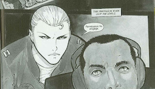
I like the motion in the top panel and the emotion in the face of the character on the left.  However, David Loren looks concerned in the bottom panel which is not necessarily part of his character.  I would think that either a blank expression or a smug look of indifference would be more in line with how he is portrayed in the book, even in light of the threats that are levied against him.

7/10 – The art is quite good, and the issues that I have with it will in no way negatively impact my desire to purchase issue two.

Overall:
9/10 – Good art is paired with a great story.  It is definitely a comic that I will be following and hopefully a lot of others will as well, as Hawkins and Ekedal deserve time to build up more of their story.