Yesterday
netted quite the haul of comic books as many of the titles on my pull list had
new issues released yesterday.
Unfortunately I got in late last night and was only able to partake in a
small sample of last yesterday’s riches.
The latest issue of Transformers:
Robots in Disguise did not disappoint and is quickly becoming one of the
best books on the market as the action is fast paced and the twists and turns
are expertly crafted, not to mention the fact that the artwork is cartoony
enough to clearly carry that nostalgia of the cartoon while detailed to the
point of fitting with the darker subject matter of this book. I can already tell without reading any of the
other comics I obtained this week that that will be crowned as best of the
best.
Unfortunately
I already reviewed Transformers: RID
at an earlier date, so I fought off sleep and cracked open Mars Attacks KISS, the latest in a month of Mars Attacks one shots featuring the characters currently under
IDW’s publishing thumb.

Cover:
Many
younger people do not realize that Mars
Attacks was a series of collectible cards back in the day. Hell, some have no idea what these aliens are
while a few vaguely recognize them from the Tim Burton movie in the nineties. The covers to the Mars Attacks… series of one shots are therefore crafted to look
like those cards of yesteryear. I must
say that this works incredibly well as not only a design element, but the art
itself actually has a vague correlation to the story. I love the painted artwork and the way that
Ray Dillon uses the light from each individual’s “powers” as not only the
primary, but the only light source just gives it a really nice feel to it, even
if we are watching a human get torched right there on the cover. The triangle effect that Dillon creates works
very well as a design element as well.
9/10 – I would like a painting of this to hang in my
house. Dillon has a real knack for light
and shadow and the aliens are creepily-awesome.
Story:
Chris Ryall
does a good job of fusing the two subjects together pretty seamlessly. As weird as it sounds, this story feels like
it could fit right into place between the various storylines that Ryall writes
in the regular KISS book, the same
formula is followed for the most part and it all is believable in the context
that it is placed in.
All that
being said, the writing is pretty bland, boring and even formulaic at
times. The “twist” ending that the kids
involved are actually young versions of the original band, and the reason that
they take the persona’s they do, including the makeup, is so that the lone
remaining alien in their midst (who they take on as their guitar-tech by the
way) does not feel like he is garnering any negative attention from other
people is just weird and seems forced.
The concept, while by no means is it fresh and new, is at least
consistent with the universe it’s placed in and relatively fun.
The problem
lies in the little things, the actual execution of the plot and the dialogue
leave a lot to be desired. I kind of
feel bad for Ryall because it feels like the whole Mars Attacks… concept came from the higher ups and he had to
shoehorn two different concepts together for the sake of selling more cards or
comics or something. That does not
forgive him for poor writing on the actual issue itself but I can understand
why he may not have given it his best effort.
2/10 – Very unimpressive story born from a concept probably
forced upon the writer. It may not have
been his idea to do this particular mash-up but he cashed the check so he
should have delivered.
Art:
Let’s start
out by saying that this is definitely a step up from the art in the regular KISS book. That is not saying much though and the art by
Alan Robinson in this book is only marginally better in many places. Yeah, the aliens look cool, but that’s more a
product of their initial design than anything.
I do like how Robinson incorporated the design of the KISS costumes and
makeup with the domed-heads of the aliens.
Some of the story elements were interesting, the way that the aliens
used their new KISS-powers to kill humans along were visually appealing, but
the issue itself was very inconsistent.
There were a couple panels, and a couple pages even, that were well done
and I really liked, but others where they seemed generic. Maybe there was nothing on there that
Robinson found interesting, or that he wanted to draw, but he still needed to
show a bit more consistency, especially in the face of a weak script.
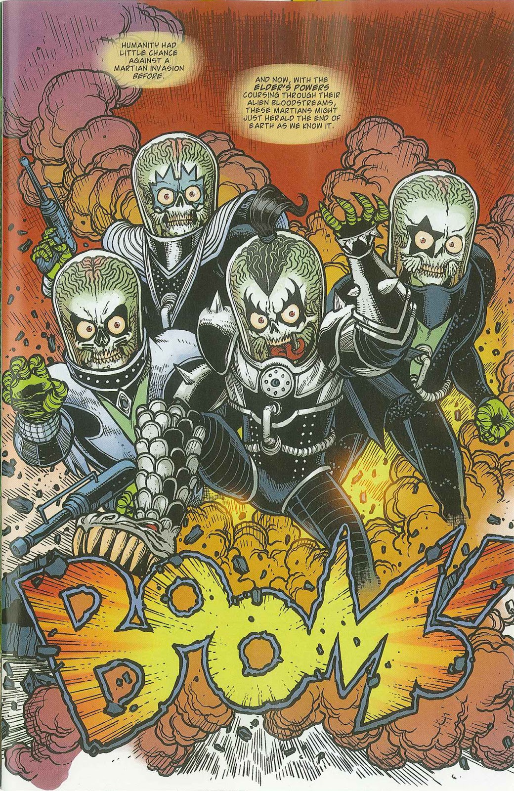
This page is just graphically awesome. From the characters to the sound effect and all of the textures. You can tell that Robinson liked making this page as much as I liked looking at it.

Probably the best all around page in the book as the storytelling is perfect, that third panel where it's the beat before the payoff, phenomenal use of a pause. The art here is great as well.

This on the other hand: lame writing and the art is marginal at best, especially the hand on the far left of the page. What the hell happened there?

This is when it was confirmed to me that Chris Ryall had checked out of this book. When the hands of the Elder, the all powerful being in the KISS-verse claps and crushes an entire invading force of aliens, and that is your big resolution to this threat...really? I just paid $3.99 for that?
4/10 – Some good, some bad, but not much to really get too
excited about. I’d like to see
Robinson’s take on a book that he is fully invested in as I can see potential
for quality work, it just has not consistently materialized here.
Overall: 3/10 – Aside
from the cover, which is awesome, the whole book reeks of inconsistency. There’s a decent formula for a plot but it is
not carried through to an adequate conclusion, and the art goes from good to okay at the turn of a page.
No comments:
Post a Comment