I missed
out on The Strange Talent of Luther
Strode when it came out fourteen months ago. The name sounded familiar to me though (I
must have seen an ad for the original series and filed it in the back of my
mind) so, on a slow comic week, I figured I might as well give it a shot. While it is not absolutely essential to read
the first series before you read this one (in my estimation) you may want to go
pick it up to see how we got to this point.

Cover:
I’m going
to go out on a limb and say that this is our good friend Luther. While I would generally find a cover that is
such a close up of one character to be boring, the little intricacies that
Tradd Moore puts into the artwork, as well as the overall design of the cover
itself makes this a really powerful image.
I am always a fan of covers that get creative with the logo and
obligatory publisher’s info box, whether it is in terms of placement or design. This cover puts the logo along the bottom and
makes it larger than normal title logos, obscuring nearly the entire bottom
half of the cover, which is fine considering that there is not much in the way
of interest below the halfway point anyway.
It also moves the publisher’s info box in the top right corner, tucking
it away where it can still be seen but is out of the way of anything pertinent.
The artwork
itself is very detailed around Strode’s face, making that the obvious focal
point. The hair could have just been
flat and lifeless, an afterthought, but actually turns into an intricate part
of the design as it pulls your attention from Strode’s face to the logo and
creates a link between the two. Usually
someone would focus on the eyes in a cover that features such a close up of the
face, but here it actually works that the eyes are slightly obscured by his
mask and hair. The fact that they are so
far up on the page creates a level of unease while also illustrating the bulk
and power that resides in the title character.
That’s an old Jack Kirby trick, and it works perfectly here.
The
coloring (I’m assuming by interior colorist Felipe Sobriero but please correct
me if I’m wrong) is married perfectly to the lineart. It’s almost like the two artists are of one
mind because just as the lineart goes slightly out of focus the further away
from Strode’s face that we get, so does the coloring. It’s a masterful job of creating a piece of
art between two people.
9/10 - Great job creating not only a quality piece of art,
but also a mood, and even a narrative.
We now know, even without having read the previous series, that Luther
Strode is one intimidating, badass guy.
Story:
There are
two ways you can read this book. You can
come into it familiar with the character of Luther Strode, his background and
his motivations (or at least as much as was divulged in the first miniseries)
in which case this will just seem like a continuation of that book for the most
part. You can also come into it as I
did, completely ignorant to any history or backstory of the character, and it
reads like a mystery. At this point,
with just the initial issue in my hands, it is not bad. I am interested in who or what Luther Strode
is and how he got to where he is as a character. What is his motivation? Why does he seem to be impervious to physical
attacks? What’s with the mask? All valid questions that may or may not have
been answered in the first miniseries.
The problem is, if they have already been answered, and they are not
expanded upon or at least touched upon in this miniseries, the whole thing will
be for naught. I have a feeling that
Justin Jordan will address that by the end of the miniseries (to some degree at
least) but I have seen much more prominent names in the industry come up far
short before.
The story
itself takes the traditional revenge plot and adds a little mystery to it. It also adds a shit ton of brutality, but
that seems strangely appropriate here.
It will take some time and additional issues to determine what kind of
format this story is going to follow. Is
he just going to kill his way to the top?
Does he have some ulterior motive in mind? As of right now it looks like he has killed
just a bunch of lackeys (in this issue at least) so what is he going to do when
faced with someone with a higher pay-grade?
Will he still massacre with impunity or does he have a message to
deliver? If these have all been answered
in the previous series, let me know, but the way this story starts out, it
almost seems like a continuation of the first.
8/10 - I didn’t really expect to like the comic as much as I
did. It features tons of violence, which
is oftentimes over the top, but gives me the impression that that is the only
avenue that Luther Strode can follow to enact his vengeance. It seems to use that violence as more of a
plot-point as opposed to a crutch or “shock factor” tactic.
Art:
You would
think that art this cartoony would not fit with the extreme violence that the
script calls for. Well first of all, you
would be wrong, and second of all, have you ever read Invincible? The influence of
Ryan Ottley on Invincible and Rob
Guillory on Chew is clear in Tradd
Moore’s art. He is a little more
heavy-handed with his inks than the aforementioned influences, but you can
still see where he is coming from. The
storytelling is a little hard to interpret on some pages, causing a second or
third look just to make sure, but all in all Moore does a great job of creating
a mood without changing his style to something more realistic.

I'm a sucker for an establishing shot of a diner, i don't know why, maybe it's the checkerboard floor.

This took me a couple glances to realize that that was a manhole cover that was flung like the world's deadliest frisbee.

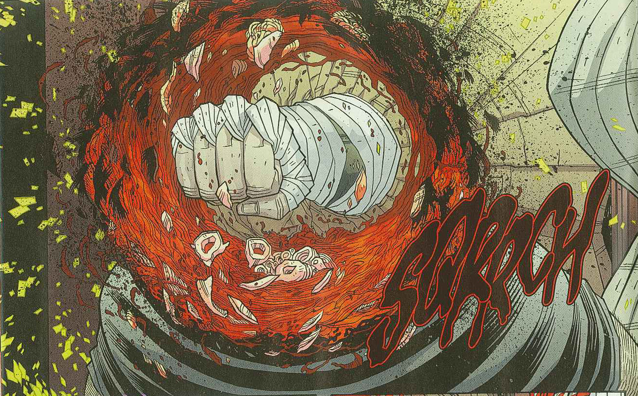
And here is your daily dose of gore, a heart and an exploding head. You're welcome.
I don’t
really have anything nice to say about the backups. The Kate Leth one-page synopsis about the Valentine’s Day
massacre is okay, nothing special. The
Yale Stewart backup is not good. This is
unfortunate because I love JL8, but the storytelling is really bad. I had to go
over the two page story multiple times to even understand what happened. While I love his style on JL8, I don’t think
it really fits here and with this subject matter either.
7/10 - The storytelling snafus are minor and do little to
detract from the overall feeling that Moore ’s
art provides. I am definitely more of a
fan of this kind of art than I am of the more realistic art, but ultimately it
comes down to the overall impression, and Moore ’s
is one of quality.
Overall: 8/10 - I
highly recommend checking this book out.
The first issue does a lot of initial plot-building but I have a feeling
that in the hands of Jordan and Moore, it will all pan out in an awesome and
bloody way.
No comments:
Post a Comment