Showing posts with label Sam Johnson. Show all posts

Thursday, January 8, 2015

Comic Review: Cabra Cini Voodoo Junkie Hitwoman

                It’s time to dip our toes back in the Actuality Press waters once again as Sam Johnson keeps churning out title after title for our pleasure.  “Dark New Year”, the current release sees Cabra Cini back in the forefront.  Cabra Cini is a character that made an appearance a while back in the Geek Girl/Mr. Mash-up anthology.  In fact, the first story in “Dark New Year” is a reprint of that story, so I won’t get into much detail on it, but if you want to check out my review, go here

                After that, we get a few art pages, showing cover designs and some shots of characters before we head into preview art from the new mini-series that will be released this year.  Johnson has done a great thing here, building up the interest and anticipation for his new series with the free digital comic.  I wish Sam would start pimping out Eat @ Shrimpy’s, it would be an international success overnight. 

                The preview pages are broken down into two sections.  One is an unlettered preview, which is predictably a little hard to follow.  I have no doubt it will get easier once the text is added.  The art by R.D. Ricci is a little stiff, but the varied angles and panel types make for solid storytelling.  When there are backgrounds in the panels, they are very well executed as well.  In fact, the backgrounds blow the character work out of the water.  The coloring is pretty grey and monotone, but that’s standard comic book coloring nowadays, so I can’t really fault anyone for sticking with the trend I suppose. 

                The second section is a two page lettered preview, with art by Nathan Ramirez and colors by M.K. Dodson (everything is written by Sam Johnson, in case you didn’t gather that).  This preview is an interesting setup, and while the dialogue is about as stiff as the characters in the previous preview, the premise is interesting and one that I am actually interested in seeing to completion.  The art is dark and gloomy, fitting for this type of story.  Again, the backgrounds are a highlight as Ramirez looks like he really referenced the building/car/etc. instead of drawing them from memory.  The character work is pretty good as well.  The acting of the characters is a little hit and miss, but it doesn’t really make you stop and wonder what the hell’s going on, which is a good thing. 
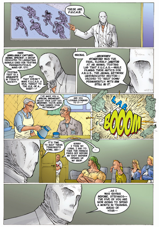
                I am definitely interested in seeing where these stories go.  While “Voodoo Junkie Hitwoman” is a bit convoluted of a concept (not to mention a title), the product itself is pretty well done.


            I would suggest giving this a shot.  Hopefully it will get picked up by a publisher as well.  As an artist that has done work on spec before and never been paid for it, I would love to see these artists get paid something for their work.  If you want to check it out, “Dark New Year” can be found FREE at www.actualitypress.com and www.drivethrucomics.com.

Thursday, November 20, 2014

New Comic Review: The Almighties #0

We are going to take a slight detour from the Guardians of the Galaxy this week and look at a new comic from Actuality Press that may ring a few bells.  Next week we'll get back to our retro review of the space-travelling heroes.

                A while back, Sam Johnson, creator of The Almighties, asked me to review The Almighties#1 as well as Geek-Girl and Mr. Mash-Up #0.  He recently contacted me as The Almighties are back with a Zero Issue!  While I was not super impressed with issue #1, let’s see how issue zero shakes out.  But first, the official stuff from Sam himself:

The Almighties #0 is out now - along with a chance for newcomers to catch up on the team's debut adventure in The Almighties #1 new Limited Variant Edition – both available at www.actualitypress.com

Cover:
                Artistically, the cover is better than that of issue 1 in my opinion.  While it is still a team shot, the overall drawing is much better this time around.  Though the “team” concept seems a bit fractured as no one looks happy or very trusting of one another.  Regardless, Juan Ramirez does a decent job of drawing each character, and the inking and coloring just add to the quality of the illustration.  I really enjoy the clarity of the Almighties logo as well.  It is instantly iconic and something that should remain relatively unchanged, regardless of the media that the Almighties may inhabit in the future.

8/10

Writing:
                Despite the fact that this is a zero issue, the events actually take place after those of issue one.  The first thing we get is an abbreviated origin of Maxi-Tron (I’m sorry Sam, I can’t read that name without thinking of Maxi-Pad).  I’m not really sure where that fits in the grand scheme of things, but I am always down for a good origin story.  Johnson does a good job of managing a multitude of artists by giving each one of them a specific story to tell.  Some are more successful than others, but the fact that he splits the art duties up in this way helps to ensure that there isn’t a strange and abrupt transition between pages, it all feels more natural.  Johnson also does a good job with the issue as a whole.  By utilizing the tried and true “tell me about your teammates” way of storytelling, we are able to learn the origins of the various members of the team in a more natural manner.  While this way of doing this is far from revelatory, the fact that Johnson doesn’t take the easy way out of just telling the origins shows that he has thought about the book and how he wants it to flow. 

                Unfortunately, most of the meat and potatoes of the stories themselves aren’t great.  Nite Fang’s story (written by Mike Gagnon) doesn’t really do much besides tell us that he was a jerk that was bitten by a werewolf.  There is very little backstory contained in those two pages that would make us really care about the character.  The Ms. F story, while not really an origin, is just…odd.  The dialogue is a bit unbelievable.  It’s almost like he’s trying to make it conversational, like how real people talk, but it comes out a bit forced.  The origin of Mason is two panels and a bunch of dialogue, again, not really making me care too much about the character.  That’s the problem.  In an issue that is supposed to be a re-introduction of the characters, we don’t really wind up caring too much about any of them.

                This takes us to the new character, Wayne Winston.  The fact that his origin story takes up so much space is a blessing and a curse.  While it causes me to start to care about him as a character, it shows what Johnson could have done with the other characters.  The final story revolves around Stefanos.  After an odd introduction to his character (something tells me getting a blowjob behind the counter of your restaurant violates all sorts of health codes), President Obama comes in to offer an opportunity to Stefanos.  In issue one, Agent Coleslaw is killed in the big fight at the conclusion of the book.  Obama wants Stefanos to go back in time, using a cosmic cube with a reset button (seriously?) on it and prevent this from happening.  Stefanos accepts the mission, goes back in time, and fails miserably at his assignment. 

                At first, I thought it was silly to even have him go back in time if he was going to fail, then I thought, you know what, showing that the superhero doesn’t always save the day isn’t a terrible thing.  Then, when I saw how Johnson ended the story, I not only understood why he wrote it the way he did, but I disliked it even more.  By going back in time, Stefanos upset the timestream enough to get George W. Bush elected to a third term.  Hardy har har…  That’s some low hanging fruit you’re picking with that one.  It’s neither original or funny, unfortunately.  IN all honesty, instead of going for the easy joke, he could have spent those extra pages filling out the origin stories of the Almighties.

5/10 – While the way the story is told is good, the content, be it the actual stories themselves or the way they are written (sometimes I don’t know if Johnson is trying to write a specific dialect or if he just forgot to proofread) is not up to par.

Art:
                The only thing I can say, is that if Juan Ramirez had drawn the whole book, it may have pulled everything together and made up for some of the glaring weaknesses in the script.  Unfortunately, while the art is not terrible, it is not inspiring at all.  While I do like the cartoonier art of Graham Pearce’s contribution, that is unfortunately the highlight of a lengthy book.  Pearce does a decent job in his storytelling as well.  In fact, most of the storytelling is good throughout the book, it’s just the general artwork itself that doesn’t hold a lot of appeal for me.  Could it be a matter of taste?  Sure.  I will say though, the lettering is dicey throughout.  There are many times I had to read things multiple times as they were unclear the first time around (something you never want to have to do). 

                I will say this though, the drawing of Bush at the end of the issue is pretty spot on.

5/10 – No one is winning any awards here, but they put a lot of work into the book and it shows.  They should be commended for their efforts even if the results weren’t perfect.


Overall:  5/10 – Even if I saw this book on the shelf in a comic shop and picked it up, I probably wouldn’t have bought it based on the art.  After reading it, there are some good things here, there’s the seed of competent storytelling and a couple funny moments.  But it was mightily inconsistent.  I am looking forward to the further adventures of Geek-Girl though, as I enjoyed that book.

Thursday, May 30, 2013

Comic Review: The Almighties #1

                Sam Johnson either really values my opinion or he’s a masochist.  You may remember Sam as the writer of Geek-Girl and Mr. Mash-up from the review I did a couple weeks ago.  While those comics were relatively well received, they were in no way pillars of creation, so I was a little surprised when I was contacted to review Johnson’s other book: The Almighties.  I am happy to give my feedback and to publicize his work in any way possible because there needs to be more people out there that are busting their ass to get noticed, and that aren’t afraid of a little constructive criticism to improve their craft.  That being said, let’s dive right in, but first, the official stuff:


The Almighties #1 is available in regular, Ltd. Variant, and Digital/Kindle editions at http://mikegagnon.wix.com/almighties


Cover:
                The cover, by Eleonora Kortsarz and Socrates Gucor is your pretty standard first issue team shot.  It shows the five man (well, three man, one woman, one werewolf) team posed like they are ready to go into battle, or at least ready in case a battle comes to them.  The quality of the illustration is fairly well done.  There could be a little more variation in the line weights to show depth and shadow, but all in all it’s not bad.  The characters all look different enough to be distinguished as different people (though the guy in the lower left has a decidedly “Liefeldian” mouth, which isn’t a great sign).  The helmet on the guy on the left looks like it was drawn on after figuring out what the rest of his head looked like, which is a great sign, and something you would think would be a standard practice (should be but isn’t always). 

I am not wild about how the werewolf is portrayed here.  The snout is so long that I thought it was initially a horse-type hybrid creature.  Once I knew what it was, I was a bit more accepting, but the design doesn’t scream werewolf to me.  Also, on the cover, the body hair is just represented as a series of lines.  While they are at least all going in logical directions, I would have rather seen less penwork here and instead have a nice solid outline of hair here, maybe utilizing the colorist more to provide the interior details of the body hair.  It’s just an idea, but one that would have been a bit less messy.  Right now, the hair looks almost like an afterthought which is a shame as the rest of the art on the cover is fairly well crafted.

                The one thing that perplexed me about the cover was what the guy on the lower left was holding.  We eventually learn that it’s a spit with gyro meat on it, but without knowing that going in, I had to try and guess (I never guessed spit with gyro meat).  Was it a bee-hive of some sort?  Mega Man’s arm cannon covered in feces?  I really wasn’t sure.  I realize that it’s an essential weapon of the character wielding it, but it just leads to confusion until we get a little backstory.  Something seems a bit off about the anatomy of the girl on the cover but she is covered up enough by other characters where anything that’s wrong is not readily apparent. 

7/10 – It’s a solid cover with decent coloring.  Some slight changes could have pushed it over the top but it definitely does the job of piquing my interest in the characters contained within.

Story:
                The story in Geek-Girl and Mr. Mash-up were the highlight of those books.  They were decently crafted tales that gave an idea that something larger was in the works without really spoonfeeding the reader the information.  Johnson and his co-writer (Mike Gagnon on the script) runs into trouble with this book though as he telegraphs a little too much and lacks any subtlety whatsoever.  I like the fact that he starts out in the “present” before travelling back in time to find out how we got there.  That’s a good technique and the fact that he uses it to show us the team assembled and in action before we travel back to learn who they are, while not entirely original, works incredibly well.  I was lost by the “Pimm’s” reference though, is that a brand of wine or something similar to Kool-Aid? 

                The inclusion of a drooling simpleton as the butler seemed a little ridiculous until the end, but even then it seemed unnecessary.  It feels like a lot of the book is full of unnecessary things and little tangents that feel like they didn’t need to be there.  This includes the revelation that Stefanos (the guy on the cover with the gyro meat) has to keep going to his restaurant to put the French fries on, even though “French fries” is apparently code for “meet with the president”.  Except it kind of doesn’t because then he says something to the president about his French fries burning.  My question is how does he get from outside his shop (where we see him dropped off) to the white house and back? 

We are not told the origin of everyone on the team in this issue, but we are given a peek into Ms. F and her life before superheroing, and it’s silly, almost as silly as her name which she says stands for “Ms. Free” or “Ms. Fun” because she’s a “swingin’ single” since her divorce from a controlling jerk husband.  This women’s empowerment that Johnson tries to force on us only goes as far as the first couple missions as she falls all over her teammate Maxi-Tron (which I can't read without thinking of a super-powered tampon), volunteering to help him check for testicular cancer.  Yup, that happened.  The whole exchange (which takes place over two missions) feels incredibly forced and if I was anyone else on that team I would have either quit or killed those two for talking like that.   

The fact that one of the groups that The Almighties are tracking down is called F.U.C.A.S. and they work with the television station that goes by the code name A.N.U.S. is just juvenile.  It feels like this comic is straddling the line between parody and legit superhero tale without taking the plunge to either side.  The Almighties need to go after the group F.U.C.A.S. (an animal rights group) because they blew up a building, killing an old man (who was apparently about to retire, which we learn in two of the most confusing panels in the comic).  We then cut back to the present and the action, which goes about a well as you would expect from a group of superheroes attacking a bunch of guys with ski-masks.  We also get our first mention of testicular cancer as Ms. F had a rabbit that died of testicular cancer.  The fact that this little nugget of information is divulged mid-punch is just silly. 

We are then transported immediately to their second assignment, a basement where apparently all of the aliens that have inhabited earth were gathering together for one night only to discuss their plans for world domination.  At this point, I was ready to call bullshit on the leader of this group.  It all seemed too dumb to be true and how these guys kept falling for it was sad.  What is even worse is the way Johnson tried to write the exchange between the black gangsters in the club.  I understand that he was trying to write a dialect, and probably make these guys seem like creeps so we didn’t mind if they got their asses kicked by the Almighties, but it seems unbelievable and honestly, a little offensive.  I don’t get offended easily, by anything, but these few pages had me feeling like I should apologize.  We do actually get to see The Almighties do some real fighting though, which is nice…until we get to the second exchange about testicular cancer where Maxi-tron turns to a puss because his grandfather had testicular cancer and Ms. F volunteers her services.  There had to have been a better way to manufacture a romance than this.  It seems cheap, creepy and wipes away any kid of girl-power good will that Johnson built up with his introduction of Ms. F. 

We are then transported to the third assignment that involves infiltrating a coffee shop that is surrounded by barbed wire and a large fence.  Sure seems like an evil mastermind compound to me right?  Not really.  It’s actually a totally legit coffee shop run by a bunch of black guys in the middle of a KKK-esque all white neighborhood.  Talk about not knowing your clientele.  The Almighties beat the tar out of these reputable business owners until a blonde-haired white guy parachutes in and tells everyone to “chillax” (I wish I was kidding about that).  President Obama then gets on the phone with Stefanos and tells him that the team has been doing the dirty work of some radical black person-hating bigot (because black people picked on him on the playground at school).  This surprises everyone because apparently everything that has been said was taken at face value, and no one suspected that this guy was full of shit.  Apparently all of the groups that they targeted were legit (even though the animal rights guys did kill someone in the explosion as stated - which is completely glossed over by the government by the way, and the “aliens” were clearly gangsters). 

After fighting this “evil mastermind’s” henchmen, (which includes a robot that looks like Hitler and the special ed guy that is injected with a serum turning him into a werewolf), the team enacts revenge on him by letting all of the black people he captured have their way with him.    

2/10 – There are way too many coincidences and unlikable characters here to make this a good story.  Everything that happens feels like it was thrown in to be convenient with no real forethought put into the story.  The characters are barely fleshed out and much of what is developed is just plain silly.

Art:
                There are three artists on this issue, Eleonora Kortsarz handles pages one through eleven, Pablo Zambrano handles pages twelve through twenty-two and D.C. White along with Zambrano handle pages twenty-three through twenty-eight.  You can definitely tell when we switch artists as the styles are considerably different.  The fact that the interiors are fully colored is nice, but it doesn’t necessarily do much to save the artwork from being unimpressive.  None of the artists go crazy with outlandish page designs, which is a huge bonus in my book.  They stuck to the basics and I think the book is better because of it. 

                That’s the thing, there is nothing truly “wrong” with the art.  It does lack a sense of dynamism though, even during the fight scenes where you would expect at least some level of that.  T here is an overabundance of mid-range camera shots, but they are broken up a bit here and there and we even  get some down-shots thrown in there.  The coloring is inconsistent as well.  I know, it’s done by two different people but I would hope that an editor would be able to catch that and at least ask for touch-ups.  In the beginning it is well done and serviceable, but as the artists change, the quality of the colors do as well. 

The fact that there are three jump-cuts in three panels makes this page uber confusing.  It's hard to blow something up and have us recognize it if we've never actually seen it whole (and no, writing lab in big blue letters as if that's all that survived the explosion does not help) 


This occurs over three separate battles, and just highlights how horrible the relationship between these two characters is.  Who talks like that?  It sounds like a transcipt from a porno.


Yup, the whitest guy in the room just said "Prez" Obama and "Chillax".  


And that's a werewolf and a Hitler robot because...of course it is

5/10 – It’s not the worst I have ever seen, by far, but it is closer to a fan-comic than a professional book.

Overall:  4/10 – If you want an Actuality Pres comic, I would still suggest picking up Geek-GirlThe Almighties needs a lot of fine tuning before it is ready for public consumption in my opinion.  The fact that it came out before Geek-Girl does show me that Johnson has made significant strides as a writer and I am more interested in his new stuff.

Thursday, April 25, 2013

Comic Review – Geek-Girl #0 and Mr. Mash-Up #0


                This past weekend I received an email from Sam Johnson, writer of the abovementioned comics, asking me to review them.  Mr. Mash-Up #0 is a newly released comic while Geek-Girl #0 (the precursor to Mr. Mash-Up) is a recently released variant edition, probably to capitalize on the initial appearance of Mr. Mash-Up.  Regardless, they are new to me.  I have not been paid to write this review and any opinion is mine and mine alone.  I appreciate Sam reaching out to me, but as per usual, I will not be pulling punches if I see something that doesn’t quite work for me.  I will review the issues one at a time, starting with Geek-Girl #0.

                Before I get started though, I need to print this:

Mr. Mash-Up #0, 28 pages, b&w, written by Sam Johnson, illustrated by Bruno Letizia, Eric Lamont & Meisha Mimotofu, and published by Actuality Press is available now in $3.99 Regular and $1.99 Digital/Kindle editions, along with Geek-Girl #0, at www.geekgirlcomics.com . Suggested for mature readers.

This review is going to take awhile, best to go and get yourself a beverage and settle in.

Ready?  Okay, here we go.

Geek-Girl #0


Cover:
                The cover by interior artist Sally Stone-Thompson is not bad.  It has a very classic superhero element to it in terms of a flying character high in the air amongst birds and clouds.  The slight downshot doesn’t lend a whole lot of dynamism, but once you read the story you will realize that, at least at this stage of the game, dynamism isn’t really the point.  I like the fact that the clothesline is entangled on her foot a bit, almost as a tether to the real world and the fact that she wasn’t just born a superhero, she became one.  It grounds her in reality a bit.  I would have liked to have seen something behind her aside from clouds though.  We are clearly looking down ever so slightly, so there should be something on the ground to look at, especially since she obviously flew through someone’s backyard to get the clothesline tangled on her foot.  There are slight anatomy issues on the hands and feet of Geek-Girl, but it is not a deal breaker for me in any way.  The coloring is pretty good and the logo against the light background is effective and easy to read.   

6/10 – It’s a nice simple cover, perfect for a debut issue.

Story:
                The story by Sam Johnson is actually pretty good (and I’m not just saying that for Johnson’s benefit).  It is a nice origin story, which gives us a glimpse of how Geek-Girl got her powers while also leaving a little mystery for future issues.  There are a couple minor plot holes that come to mind, but nothing that really derails the story all that much, and honestly I wouldn’t be surprised if in the future they are addressed.  For example, the powers are acquired by a microchip in a pair of glasses.  This is obviously something that Trevor, the creator worked long and hard on in order to impress a girl, and if he really wanted to he could probably sell it to the government for big money…yet he just lets it go in a game of strip poker.  Don’t get me wrong, that’s an incredibly honorable thing to do, but it’s hard to imagine that he is willing to let the glasses go so easily. 

                I would also like to know why Ruby (Geek-Girl’s alter ego) wants them, or more importantly, why she utilizes them after she acquires them.  She states that she wants them because she knows how important they are to Trevor, which seems, to me at least, like a lame reason to want something, but that doesn’t really jive with why she puts them on and utilizes the powers that they grant her.  This also doesn’t paint Ruby in the best of lights as a person.  Is she an anti-hero?  Is she a bad person?  Cheating a drunk guy out of a multi-million dollar project at a game of strip poker is not necessarily the kind of origin you expect from a hero.  I have a feeling that Johnson will address this as the story unfolds in subsequent issues, but a little hint here or there in this issue would have helped.  I also assume we will find out how Ruby realizes the glasses can make her fly.  We see her flying on the cover, and in the beginning of the issue (before the flashback about how she got her powers) she is flying as well, yet there is no mention that the glasses grant that power.  In fact the only power that we are shown during the “origin” sequence is that of super strength.  Again, I assume that Johnson will clear this up eventually; it was just odd to see her flying multiple times in the beginning with no hint that that is one of the powers granted by the glasses. 

                Sam Johnson does write dialogue very convincingly, even in “super-human” situations.  The conversations are believable and something you would expect to overhear, which is a good sign.  The last couple pages feel a bit rushed, like he was trying to squeeze in a villain before he ran out of room, but it does add to the mystery and actually makes me curious about the next issue, so I have to give him a lot of credit for that.

6/10 – This is a good origin story and a very good setup for future issues.  There are a lot of questions yet to be answered about Geek-Girl, her powers, and everyone’s motivations, but Johnson seems like he has the answers, he’s just waiting to reveal them to us. 

Art:
                I will be the first to admit that the manga-style that Sally Stone-Thompson utilizes is not really my cup of tea.  I will also readily admit that it works very well here.  There is really not much in the way of epic superhero action in this issue and she handles the “talking head” scenes very well.  The people can be a bit stiff, and the acting is a bit wooden, but it’s not terrible by any means.  Stone-Thompson starts out exceptionally well in terms of the art, there are a few anatomy issues here and there, but up until the last three pages, the art is solid.  That goes away quickly when Geek-Girl steps outside.  The fact that it’s raining is not that big of a deal, it’s how Stone-Thompson renders the rain that makes it so distracting.  It literally looks like she took a Sharpie and drew lines all over the place.  I’m not sure if she was up against a deadline, burnt-out or both, but the stark dip in quality from the rest of the book makes it look as if this section was drawn by a different artist altogether. 

One of the main problems with Stone-Thompson’s artwork in general is that there is very little variation in terms of the shot selection.  If you look at a page from this comic, you will see that Geek Girl is generally the same size in each panel.  This isn’t too big of a deal when there are fewer panels on the page, but towards the end when the number of panels seems to increase for some reason, we could have definitely benefited from a long shot of the scene, just to establish where the characters are.  The fact that the first sequence where Ruby acquires the glasses is completely devoid of backgrounds, only to be followed by a scene that is rich in them is odd too. 


I love the amount of detail in these two panels.  They are minor in the grand scheme of things in terms of the story, but they do a great job of establishing the scene while providing something interesting to look at.  The curved railing is great!  Stone-Thompson could have easily gone for something more generic here but didn't and should be commended for that. 

In contrast, this is part of a three-page sequence that should be the high-point (the first time Ruby actually uses her powers to help someone) but because of the way the art looks it feels rushed and unimpressive.

6/10 – A solid beginning gives way to a convoluted and (what appears to be) hastily drawn final three pages.  With a little anatomy work and panel variation, Sally Stone-Thompson can be very good at this whole “comic book” thing.

Overall:  6/10 – There are elements here that I don’t care for, but overall, it is an interesting concept that, if fleshed out a bit more (or at least more of it revealed to us as the readers) could be very interesting.  I’m definitely interested to see where this story goes and I would absolutely recommend giving this book a shot.

Mr. Mash-Up #0


Cover:
                I’m not really sure I “get” the cover by Mike Bunt.  It looks like the creepiest Valentine’s Day card ever, and that doesn’t really make any sense based on who Mr. Mash-Up is or what the comic is about.  The illustration itself is nice enough, and the bright white of Mr. Mash-Up in stark contrast to the rest of the cover is effective in drawing your eye to him.  The biggest problem, and where this cover fails exponentially, is with the logo.  I’m not too keen on the logo itself as it is not easily readable in its own right but what makes matters worse is that it is virtually unintelligible on the burgundy backdrop of the cover.  The only thing that even clues me in to the fact that there is text there at all is the white of the gradient running through the letters. 

1/10 – I like the face but the fact that the logo is completely lost amidst the background really hurts this cover. 

Story:
                There are actually three separate stories here.  Sam Johnson is the writer of all three with a different group of artists handling the visuals on each.  The first story, “Voodoo Trespass” focuses on Cabra Cini: Voodoo Junkie Hitwoman.  It’s kind of like a female version of the Punisher with a little occult magic thrown in.  This is probably the most complete story and despite the dimension hopping that she does (read it and that last part will make sense) it is still remarkably easy to follow.  Johnson does a good job of feeding us more information on Cabra Cini before she became involved in Voodoo, while also showing us why she started to dabble in dark magic through the course of the story and not making it just a big information drop at the beginning.  Mr. Mash-Up makes an appearance at the end, but his significance aside from being there to get in Cabra Cini’s way is not entirely clear.

                The second story, “Return of the Prodigal #!%*” takes place shortly after the first story ends (and that’s one thing Johnson excels at – making the three stories feel sequential and cohesive).  “Return” features a large battle and is therefore a bit confusing at times.  Whether this is on purpose or just a happy accident, I have no idea.  The story itself does give more of a nuance to the character of Mr. Mash-Up and is the first time we have seen him in a “starring” role. 

                The final story, “Gold Town: ‘A Whole Other Thing’” goes back to being about those around Mr. Mash-Up and not about him specifically.  I didn’t care for this story as much, probably more due to the fact that the main character in this issue “Pete the Pimp” is just an unlikable S.O.B. than anything else. 

5/10 – At the conclusion of this issue, I found myself wondering where this was going.  Unlike Geek-Girl, this doesn’t really lay much of a framework for a future issue.  Sure, you can create more stories with the characters, but they aren’t begging for another issue like Geek Girl was.  I really wanted to see where that was going next, with this one…not as much.  If it was part of a back-up story though I would read it.

Art:
I love this page!  You would think that so much going on in the panel borders would make everything kind of confusing, but it doesn't because of how heavily the art is shaded.  I also have to give  Letizia credit for having the cajones to do it.  I'm sure this page alone took a long time to complete.

“Voodoo Trespass” – Bruno Letizia
                The art was decent, had a very “underground comics” kind of feel to it.  Letizia does a good job of acting and storytelling (finally, some variations in the shots!) but the anatomy could use a little work and the shadows feel a little forced at times, like they are there to spot blacks without any other kind of purpose.

It's just hard to tell what's going on.  I though Mash-Up was getting stabbed in the second panel, but he's not.  Color or shading or something to help separate the characters would help, but it really all boils down to storytelling.

“Return of the Prodigal #!%*” - Eric Lamont and Mike Bunt
                Anatomy is an issue again here, and we are back to a bunch of medium shots broken up by a medium-close shot every now and then.  There is a lot of dynamic action which unfortunately gets lost because of the open nature of the art.  By that, I mean that there is very little shading, be it hatching, cross-hatching or just splotches of black which makes it hard to discern who is who and what is what.  Add to that the fact that everything looks like it was inked by a sharpie, with very little line delineation and what could have been is usurped by what is.  This art would have been better served if it was in a colored comic where the colorist could work hand in hand with the other artists to create more space and dimension between all of the elements in the panels.  

I don't even care that the girl's legs are too long in the second panel, the amount of detail and acting here is great, though the way Pete moves in panel five would indicate that the window is on the opposite wall to where it actually is based on panels two and seven.  

Any time you can give me a downshot of a populated bar, I'm game.  I don't know why, I just find them interesting.

If any sequence was calling out for pulling back so we can see the action a bit better, it would be this one.  The slanted panels add some dynamism and is a good stylistic choice, but I had to go back and try and interpret what was going on (it took me a bit to realize that panel two is the back window of the car), and that's not something you want in an action sequence.

“Gold Town: ‘A Whole Other Thing’“ – MeĆ­sha Mimotofu and Eddy O’Bomsawin
                The detail is great and the acting of the characters is very well done.  The closing sequence is a little confusing because of the shots that Mimotofu decided to use, but overall the artwork is nice.  The lettering, in particular the choice of font that was used for Pete’s exposition is hard to read. 

6/10 – Mimotofu outshines everyone else here, and O’Bomsawn does a great job inking and keeping everything clear.  I was less impressed with “Return”, but “Voodoo” had some decent artistic moments.

Overall:  5/10:  I like it, not as much as Geek Girl, but it was definitely better than some of the garbage that is being published.  I am interested in seeing what Johnson has in store for these characters, as the concept itself is interesting enough, it’s just some of the execution that is lacking.