It seems
relatively appropriate (in my mind anyway) that I review the penultimate issue
of Punk Rock Jesus because one of my
earlier reviews was the first issue (way back in July). Since then, it has consistently been the best
comic I have read all year, with each issue revealing a little more of the
iceberg that we were going to inevitably crash into once issue six rolled
around.

Cover:
I still
love the simplicity and the design of the covers. They make great use of the solid background
color to allow not only the cover itself to pop off the shelf, but also the
brightly colored image on the cover to really pull you in. This contrast from the dark, brooding, and
sometimes muddy interior art does a great job of reeling you in to the
book. If I was just picking this book up
fresh, I would definitely be drawn to the covers more than anything else on the
shelf.
The image
itself for issue six is a bit “hit you over the head” in its directness (which
is one thing that Murphy has had fallen back on quite a bit in the series) but
it is pretty much expected that you would receive at least one “crucifix” pose
by the time the series ended. The fact
that Chris is posed against the backdrop of the upside down cross also creates
an interesting mirrored design element while also highlighting the fact that
many of Chris’s decision make him seem very un-Christ like, as well as possibly
foreshadowing events toward the end of the book.
10/10 – A very powerful cover that is not only well drawn
but designed the right way. As the apex
of Jesus’ life had him up on the cross, the final issue of this series should
naturally end with its own “Jesus” in the typical Christ-like pose.
Story:
Murphy
further proves that while this story is titled Punk Rock Jesus, it is more
about the redemption of Thomas McKael, the bodyguard tasked with protecting
Chris from harm. We finally get a big
reveal about Thomas’s past, which if you haven’t read it, go now, I’ll wait,
it’s too good to miss. I never saw it
coming and honestly didn’t think Murphy would even address it, but holy shit
that was a good piece of writing. It
really fleshed out why Thomas was so hell-bent on protecting Chris from the
get-go and where his faith came from.
The depth that Murphy gives him makes us care even more for him later
when he makes the decision to give his life to allow the kids to escape.
I was wary when
I finished issue five. I really wondered
how Murphy was going to wrap everything up in just one more issue, and really,
where he was going with the story in general.
It was a good story, don’t get me wrong, but it was a matter of trying
to figure out what his plan was for these characters and how it was all going
to come together in issue six. Spoiler
alert: he delivered on all of it. The
Thomas stuff was great, as well as the various revelations that popped up
regarding the baby thrown in the water way back in issue one. While I don’t want to give too much away,
Chris’s fate is a little surprising as well as the way the entire comic wraps
up, and not in a good way. Don’t get me
wrong, I don’t mind the way Murphy handled Chris, but the final page, while
beautifully rendered, leaves me feeling a little hollow. Everything gets wrapped up well, but that
last little bit, just kind of gave me a “that’s it?” kind of feeling. It almost felt like Murphy knew he had to
give the “bad guy” his just desserts but ran out of room so conjured that up in
desperation.
7/10 – Murphy wraps everything up masterfully in his final
issue of the series even though the final sequence felt a little out of
place. The heart of this book and the
true star of this series really shines through in the end though and he needs
to be commended for giving us that big payoff.
Art:
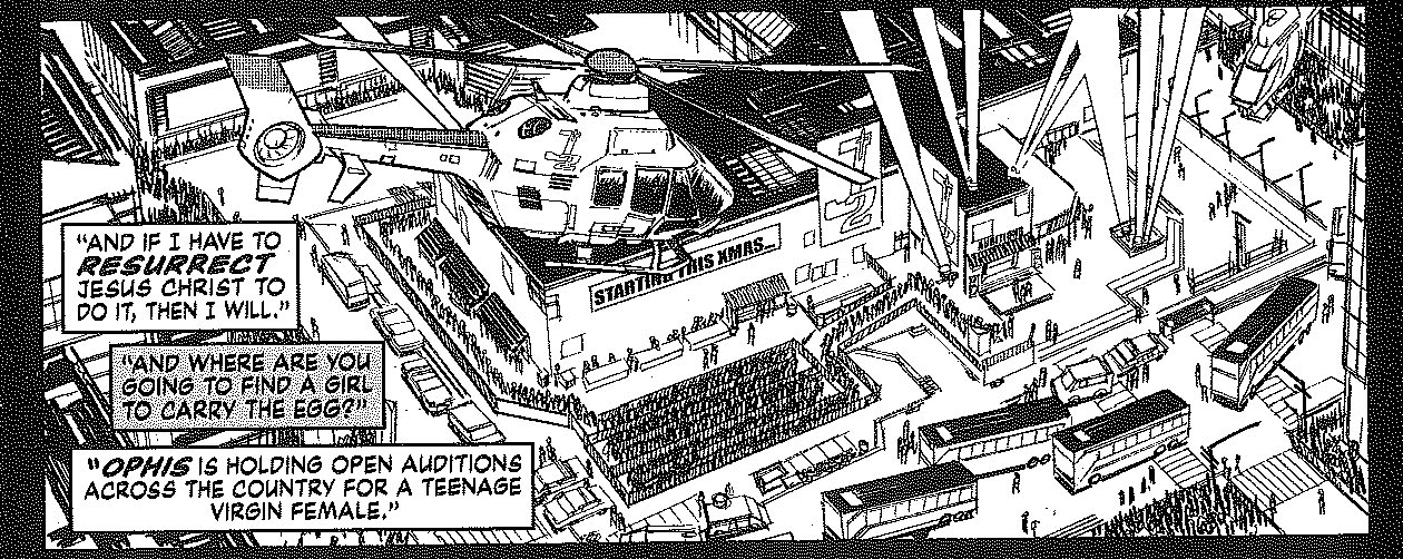
The art is
still the highlight of the book. The
massive scenes that Murphy paints just using ink and zipitone are more
impressive than anything I have seen in a comic book this year. While he exhibits a master’s touch in the
large scenes, it’s the smaller, more emotional moments that make you realize
the true power of Murphy as a storyteller.
Small bits such as the look on the face of the characters at key
moments, or the way he paces the story to let the moments that need to breathe
really do so. All that completely
overshadows some of the more blatantly obvious symbols that I found unnecessary
(though I suppose they are warranted given the topics covered in the
book). This is not just a comic book,
this is art in its highest form and the fact that it is ending is, honestly, a
little sad.

As each revelation about his father and his past is revealed, we can feel Thomas breaking down more and more and as the revelation about the death of his parents washes over him, you know what he is going to do in the coming pages, whether he is currently in custody or not.

This is how action sequences should be, quickly paced and chaotic instead of acrobatics with punches on the end.

This issue was incredibly heavy with dialogue, but it's the panels like the two on the bottom, where everything is quiet and we can all think what Thomas is thinking, that's what makes this book stand out.

Everyone has an emotional reaction to what is going on here, and Murphy does a great job of showing that. The expressiveness of the eyes is not wasted as every page and every panel is full of importance.
10/10 – The good outweighs the bad by a large margin and for
that it has proven to be the most consistently well-drawn book I have seen in
years.
Overall: 9/10 – A little let down in the area of the story can’t dull
the polish that is the book in its entirety.
This has consistently been the best value in comic books at $2.99 per
issue and will be missed from my monthly pull list for sure. I just can’t wait to see what Murphy has
lined up for his next project.